Array was recently engaged to work on a new primary care clinic for a pediatric health system. The clinic will function as the headquarters for primary care and will host 30 exam rooms. The users wanted to take a closer look at their registration and check-in process to see how they can best optimize their workflows in the new space. Drawing from our considerable experience using mock-ups to achieve similar goals in other projects, we immediately began the mock-up process.

In true Lean fashion, we started with a session mapping current and future state workflows for the registration and check-in area. We walked through the processes for two typical situations: a prescheduled well visit and an unscheduled sick visit. Through this mapping, we were able to determine the key physical components and processes that the registration area should include and address. These included all registration and check-in materials, including future technologies they hope to incorporate down the road; the process of checking a patient in, and the longer process of registering a new patient. With these processes in mind, we were able to think much more strategically about the design of both the registration desk itself and the flow of the area overall.

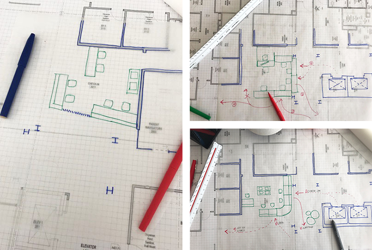
The next step in the mock-up process was the design phase. We used internal design charette, an iterative, collaborative session of brainstorming and sketching to quickly come up with different design options for the registration desk. We took the basic programmatic elements, such as the number of people needed to work at the desk, as well as the required physical components and processes identified in the mapping session as a starting point for our design. The team then proceeded to create a series of quick sketches. The objective of this exercise was to come up with a variety of options for the registration desk within the space. Once we felt that our desk design was well developed, the next step was to consider the non-physical components of the design, the processes.
It’s critical to think about how the space will be used and how people will interact with and move around the desk. In order to test our current design, we referred to the mapping exercise to sketch out some of the movements and interactions of visitors as well as clinic staff. It quickly became apparent that some of the activities such as patient consultations would not be possible in the new configurations we had created due to privacy concerns. We went back to the drawing board to rearrange the desk and provide a better location for patient consultations. This iterative design process went through several cycles of changes as we tackled various aspects of the design, including check-in, privacy, staff collaboration, and staff-patient engagement. The charette allowed us to take what we learned from the mapping exercise and start to convert our programmatic requirements and processes into design elements.

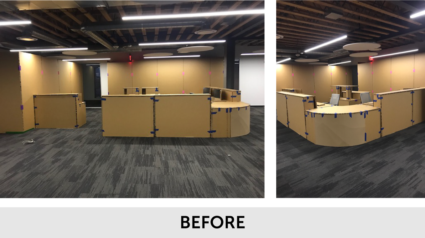
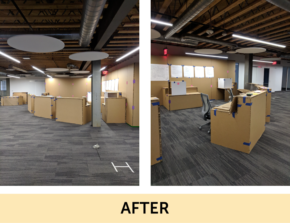
After several rounds of internal charettes, we came to a final preliminary design for the registration area and moved forward with constructing a full-size cardboard mock-up on site. We also mocked up the walls immediately surrounding the desk and taped out where seating started and where the elevator was to help the users really get a sense of what the space will feel like. The desk was constructed in modular units, essentially one unit for each person who would be working at it. This allowed us to rearrange the desk as we worked through simulations with the client. This modularity proved to be key to the mock-up’s success. Rearrangement of the desk allowed the design team to make real-time updates based on the client’s feedback. This allowed the client to feel more confident in the design and to have a sense of ownership over the final product in a way that is more effective than typical renderings or floor plans.

 The users of this new pediatric primary care clinic will feel more confident in the success of their registration space because of this process. They will know that their registration area was designed with their usage and workflows in mind and that it will be able to grow with them as their practice changes and expands. Mock-ups are a useful design tool that not only help us problem-solve as designers, but also help us to communicate our design ideas to our clients.
Learn more about Array’s approach to pediatric healthcare design.
https://array-architects.com/design-books/pediatrics


